Project Overview
Wharton Executive Education offered over 60 continuing education programs, making it critical to provide an intuitive tool for prospective executive participants to find programs that matched their professional needs. After launching the original program finder in 2014, our team undertook a comprehensive redesign in 2019 to address usability issues and improve conversion rates.
Timeline: 6 months (2019) | My Role: UX Lead, Project Manager | Team: External development agency, web analytics agency, internal marketing team
The Challenge
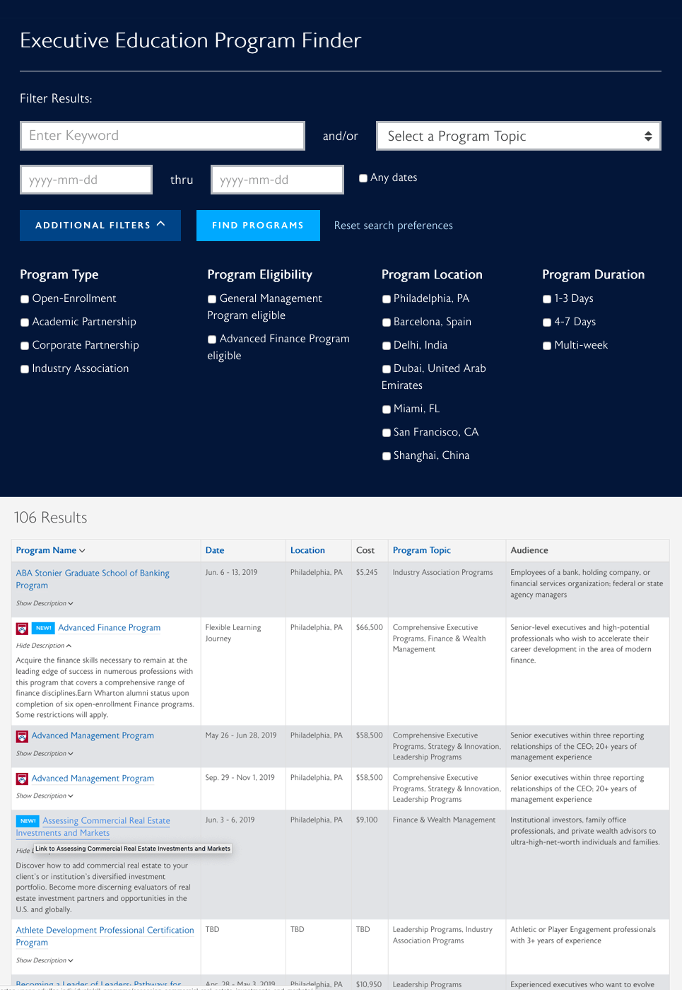
The existing program finder suffered from poor usability and low conversion rates. Analytics revealed that users struggled to discover relevant programs, particularly on mobile devices where exit rates were significantly higher than desktop. Without a way to compare programs or take clear next steps, many qualified prospects abandoned their search before engaging with Wharton.
Key Problems:
- High mobile exit rates indicated a broken user experience
- Hidden filters reduced feature discoverability
- Cluttered results created cognitive overload
- No comparison functionality for decision-making
- Unclear conversion path after browsing
Research & Discovery
As project lead, I designed the research approach and coordinated multi-method discovery efforts to identify pain points and opportunities for improvement.
Competitive Analysis: A review of six executive education providers revealed that competitors offered career-level filtering, streamlined mobile experiences, and comparison tools—features our users were requesting but we lacked.
Analytics Review: Google Analytics data uncovered user behavior patterns and drop-off points. Bounce rates and time-on-page metrics highlighted specific friction points in the user journey.
Heatmap Analysis: Heatmap data revealed that many users never discovered hidden filters, limiting their ability to find relevant programs.
User Research: Working with our external development agency, the team conducted user interviews to gather qualitative feedback and understand user needs and pain points.
Key Insights:
- Users needed to compare multiple programs before making enrollment decisions
- Career-level filtering was essential for finding appropriate programs
- Mobile users required a streamlined experience with minimal scrolling
- Visible, accessible filters were critical for effective program discovery
- Clear calls-to-action were needed to guide users toward engagement
Ideation & Solutions
Based on research findings, the team proposed design solutions that prioritized usability, reduced cognitive load, and supported informed decision-making.
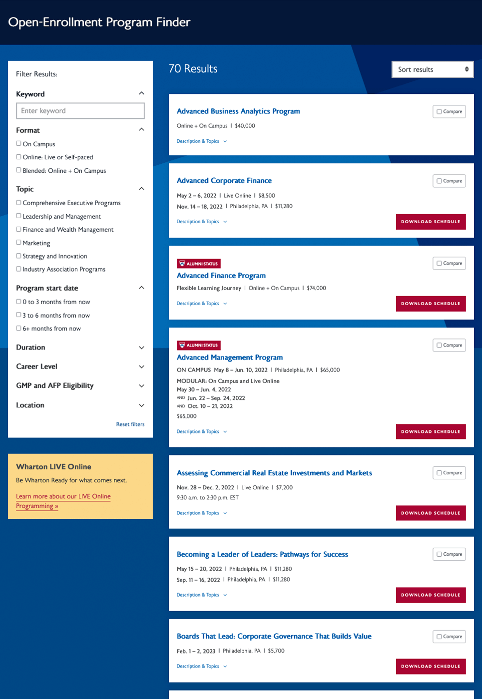
- Redesigned Layout & Information Architecture: The layout was restructured with a left sidebar filter pattern that reduced scrolling and maintained filter visibility, allowing users to view results immediately.
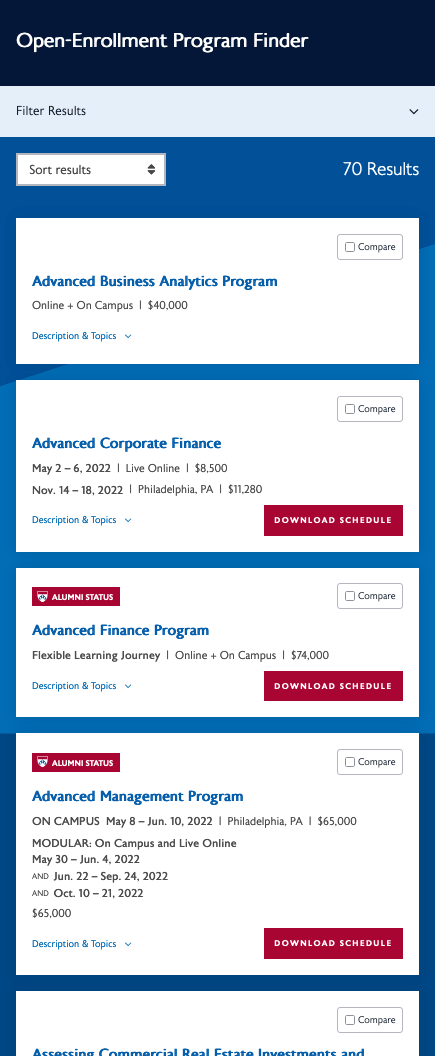
- Consolidated Program Results: Program cards displayed all upcoming dates within a single card, reducing visual clutter and improving scannability.
- Mobile-First Optimization: The mobile experience eliminated horizontal scrolling, placed filters behind an expandable menu, and enhanced visual hierarchy for improved readability.
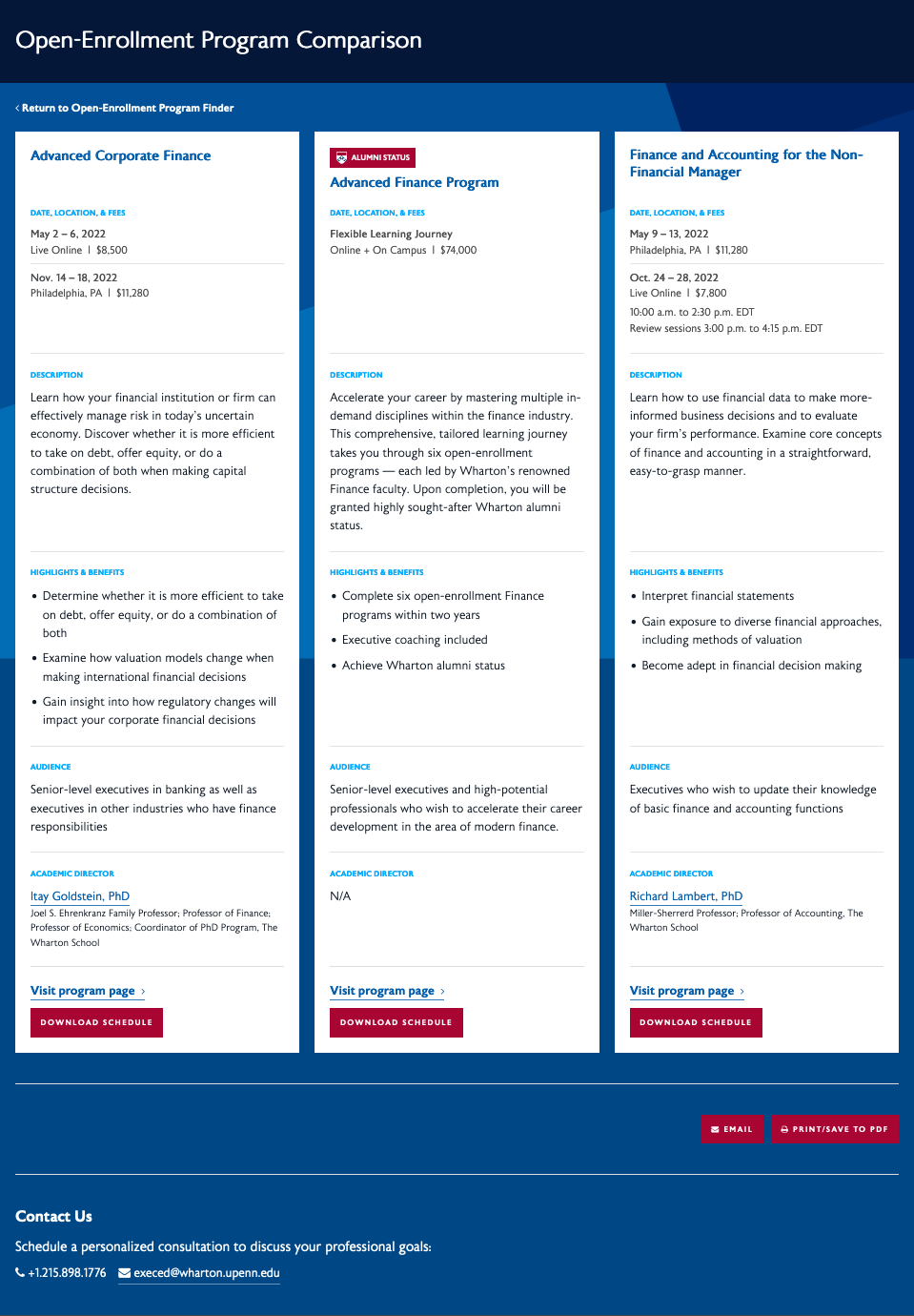
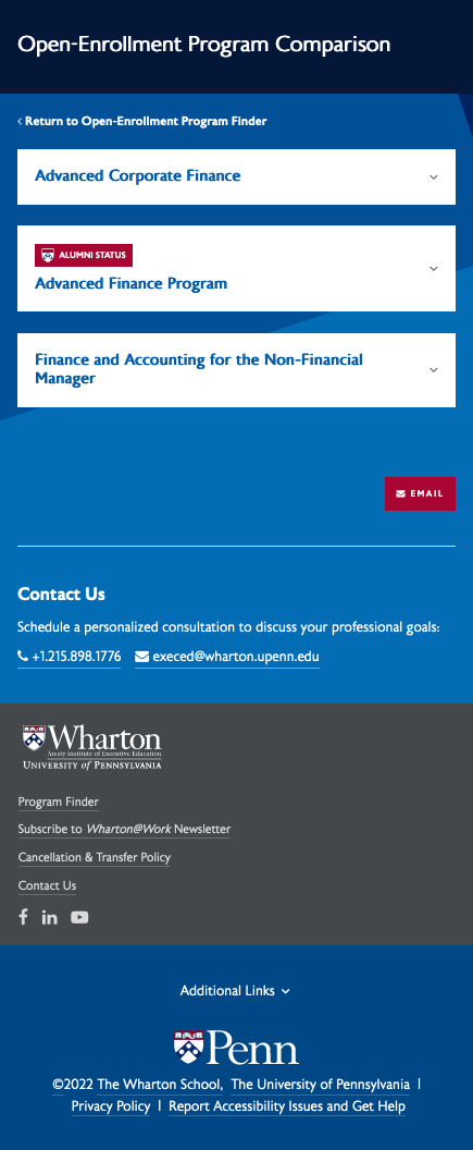
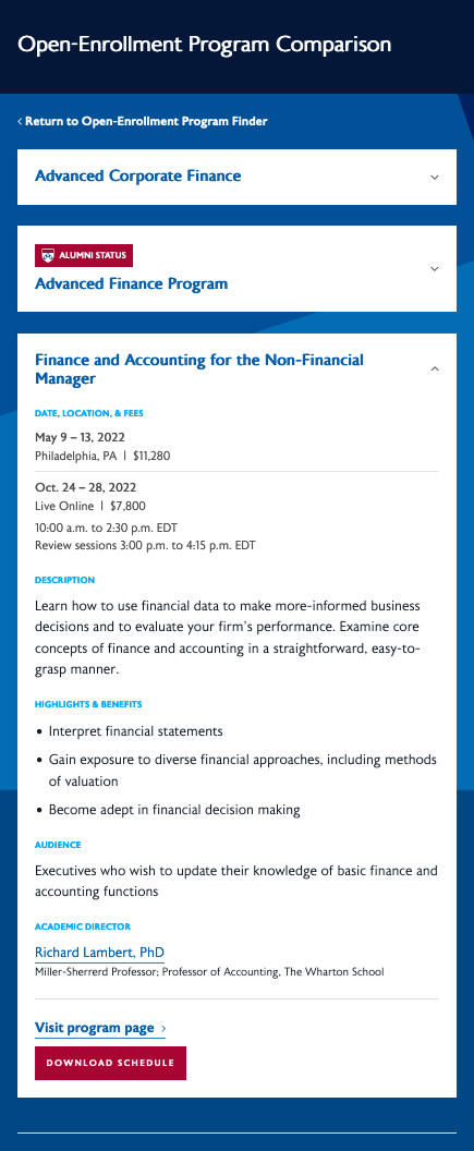
- Comparison Feature: A comparison tool allowed users to select up to three programs and view them side-by-side. Users could email or download the comparison as a PDF to support their decision-making process.
- Enhanced Filtering System: Career-level filtering and other high-value filters were added while underutilized filters were removed to reduce decision fatigue.
- Clear Conversion Pathways: Action buttons on each program card directed users to a materials download form, creating a clear next step and enabling lead capture.
Mobile Designs
Below are screenshots of the mobile views of the program finder that I art directed. Since the volume of results could be quite large, I proposed that the the filters and the program results themselves be behind collapsible toggles.
Mobile program results
Mobile comparison collapsed
Mobile comparison expanded
Results & Impact
The redesigned program finder significantly improved usability and conversion rates across all devices.
Quantitative Results:
- 9.37% increase in desktop users visiting program pages after using the finder
- 15% increase in mobile users visiting program pages after using the finder
- 12% increase in desktop form submissions
- 14.5% increase in mobile form submissions
Qualitative Results: Post-launch user testing revealed that participants who had used the previous finder found the new tool significantly easier to use and more helpful in their program search. Users particularly valued the comparison feature, noting that the level of information provided helped them make confident enrollment decisions.
Business Impact: The improved conversion rates resulted in increased lead generation and stronger engagement with prospective students, directly supporting Wharton Executive Education’s enrollment goals.
Lessons Learned
What Worked Well:
- Data-driven decision making through analytics and user research created a strong foundation for design choices
- The left sidebar pattern proved highly effective for desktop users while the collapsible filter approach solved mobile constraints
- The comparison feature addressed a critical gap in the user journey and became a highly valued tool
Areas for Improvement:
- Earlier mobile-specific usability testing could have identified friction points before development
- A/B testing on the comparison feature would have optimized its design and placement
- More granular analytics tracking from the start would have measured micro-interactions within the finder
Key Takeaway: This project reinforced the importance of balancing quantitative analytics with qualitative user research. While data revealed where problems existed, user interviews explained why — enabling solutions that truly addressed user needs rather than just surface symptoms.Text content
Example pages:
