Project Overview
ONIT Home offers a broad suite of home services — security systems, water filtration, solar energy, home maintenance, and concierge services. Their blog had the potential to be a powerful content marketing asset, but the existing design made it difficult for visitors to find articles relevant to them and did little to communicate the depth and breadth of the company’s expertise.
My goal was to transform the blog into a destination that felt organized, trustworthy, and easy to navigate — one that worked for both a first-time visitor and a returning customer researching a specific topic.
The Challenge
The original blog presented content in a flat, undifferentiated list. There was no clear visual hierarchy, no way to quickly filter by topic, and no sense of editorial curation. Visitors who landed on the blog either looking for a specific answer or browsing generally had no efficient path forward.
Key issues with the existing design:
- No category or tag-based navigation visible at the blog level
- Articles all received equal visual weight, making it hard to identify featured or high-value content
- The layout didn’t reinforce ONIT Home’s multi-service identity — a reader would have no sense of how much ground the blog actually covered
- The overall aesthetic didn’t match the professionalism of the brand
Goals
- Help users quickly self-select into content that’s relevant to them
- Visually surface the company’s range of expertise across five service areas
- Create scalable layouts that would work as the content library grew
- Align the blog’s design with ONIT Home’s broader brand identity
Design Approach
Information Architecture
The first priority was giving content a clear taxonomy. I worked within the existing category and tag structure (security, water filtration, solar, home maintenance, concierge) to design a navigation system that let users filter by topic from the blog’s main page, rather than having to scroll through everything to find what mattered to them.
Category and tag pages were designed as distinct landing experiences, not just filtered versions of the same list view — each with a brief descriptor so visitors understood what they’d find there.
Visual Hierarchy
The redesigned main page introduces a featured article slot at the top, giving editors a way to highlight timely or high-performing content. Below that, a card-based grid organizes articles in a way that’s scannable without being overwhelming. Cards include the category label, a thumbnail, headline, and a short excerpt — enough context to help someone decide whether to click without making them read.
Layout System
I designed two core page templates:
- Main blog page — Featured article + card grid with category filter navigation
Category page — Topic-specific landing page with a brief category description and filtered article grid - Article page — Clean reading layout with a sticky sidebar for related articles and category navigation, encouraging continued reading after finishing a post
Before & After
The before-and-after comparison of the main blog page shows the clearest summary of the work: a dense, visually undifferentiated column of content transformed into a structured, browsable layout that communicates expertise and invites exploration.
Outcome
The redesigned blog gives ONIT Home a content hub that scales with their publishing cadence and serves readers across all five of their service areas. Editors have flexible tools — featured posts, categories, tags — to surface the right content at the right time. And visitors have a clear, intuitive path to what they’re actually looking for.
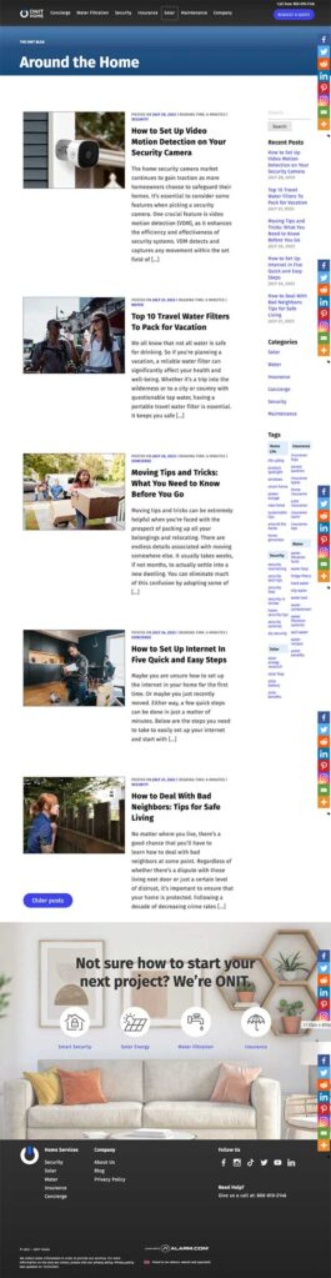
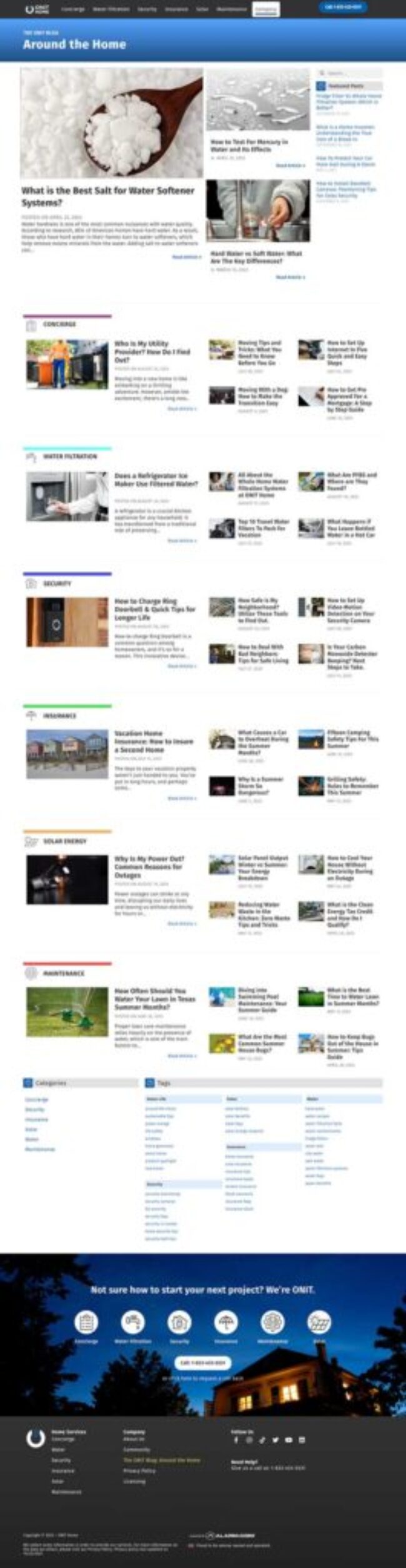
Move the slider over the image to see the before and after.
Example Layouts
-

- Article layout
-
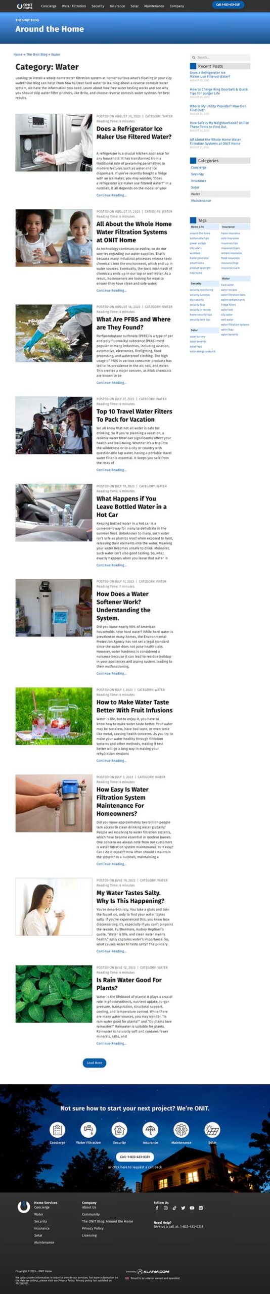
- Category page layout
-
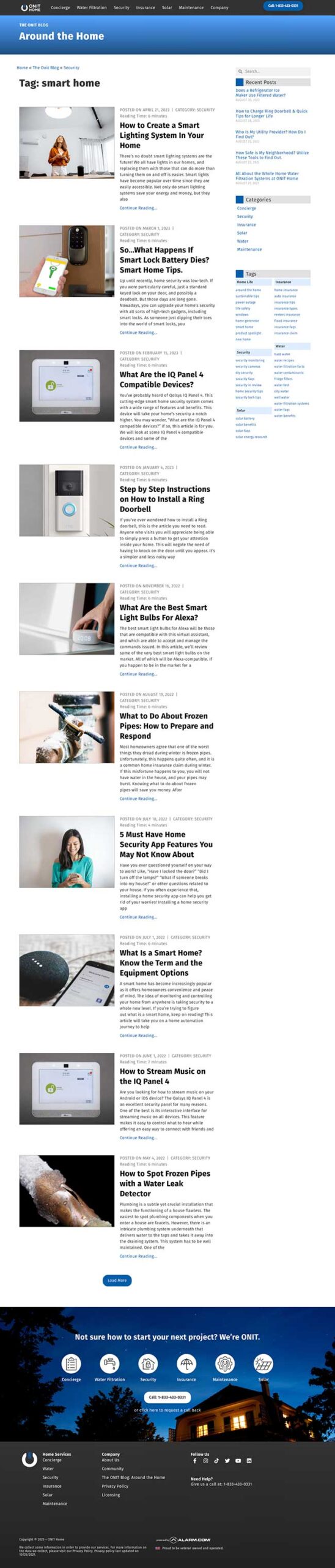
- Tag page layout