Improving Customers’ Navigation Experience
Below is an example of one of the many A/B tests ran on the Wharton Executive Education website.
Goal
The goal of the test was to see which of three layout options for program topic navigation on the home page resulted in the highest click-throughs.
Testing
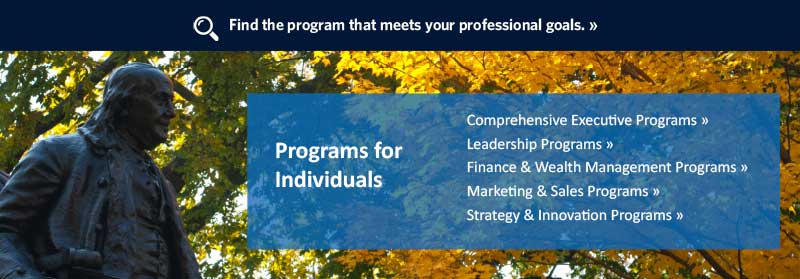
I created three different designs: a list with a background image, topics with colored image boxes, and a simple icon treatment.
Results
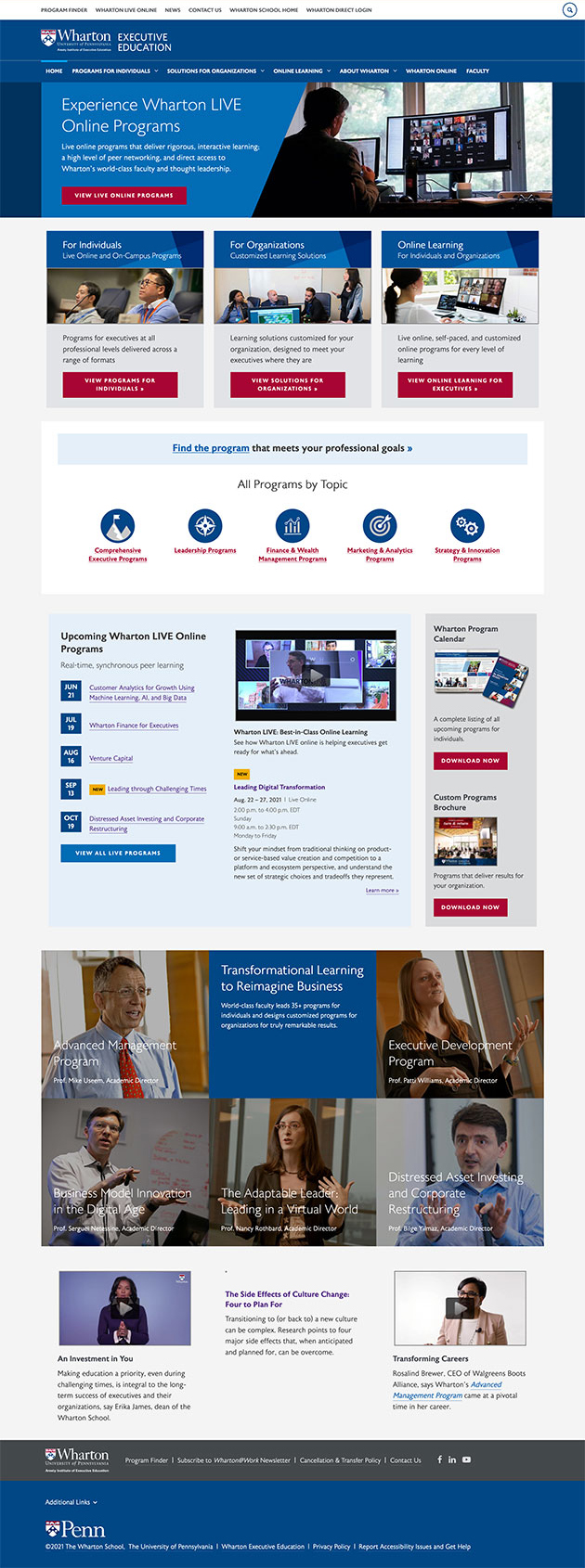
The simple icon treatment was the winner with a statistically significant lift. I proposed this treatment for the home page topic section since it offered a clear navigation choice on a page with a lot of information. The winning test had a 7.38% lift over test #1 and a 3.8% lift over test #2. The test ran for 56 days with 30,961 sessions which gave us the results with 95% confidence.
- A/B Topic Pathing Test #1
- A/B Topic Pathing Test #2
- A/B Topic Pathing Test #Winner


